Streak
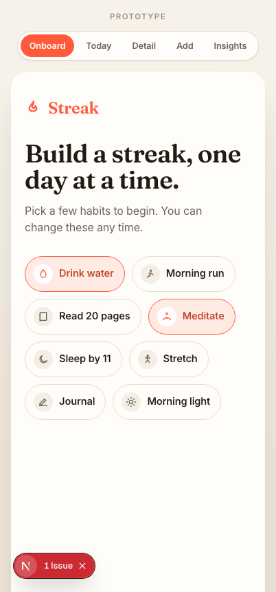
A warm, encouraging habit tracker. I took it from a one-line problem to a clickable prototype: research, user flow, a small design system, and five responsive screens.
- Role
- Concept, UI/UX, build
- Timeline
- 1 week
- Platform
- Responsive web
- Tools
- Figma, React, Tailwind
People quit habit apps the day they break a streak.
Most trackers treat a missed day as failure. The streak resets to zero, the screen turns red, and the guilt makes people delete the app instead of trying again. The tracker meant to build consistency becomes the reason they stop.
Encourage, don't punish. Progress should feel warm and forgiving, so a missed day is a small dip, not a wall.
Make daily tracking feel calm and rewarding.
One clear job: help someone create a habit and check it off today, in under ten seconds, while making the long view feel motivating rather than judgmental. Everything else stays out of the way.
The insight that shaped every screen.
Looking at how people talk about habit apps, the pattern was loss aversion: a broken streak feels like losing something earned, so the punishment for one slip is bigger than the reward for showing up. I leaned the whole design the other way, toward visible, accumulating progress that a single off day can't erase.
Guilt on a miss, pressure to be perfect, all-or-nothing.
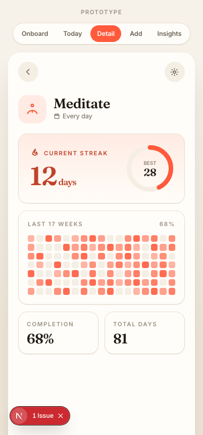
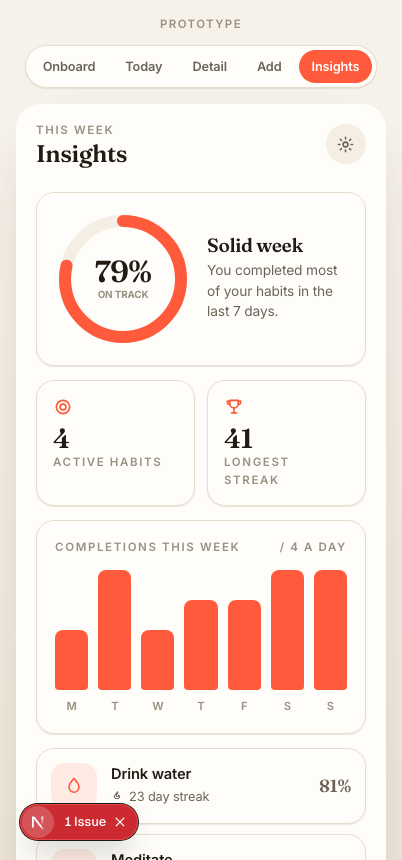
Soft streaks, a 17-week heat map, and an honest weekly view that shows trend over perfection.
One primary path, kept short.
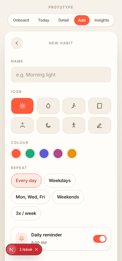
The core loop is just two moves: add a habit, then check it off. The flow below is the spine the whole app is built around.
The messy middle.
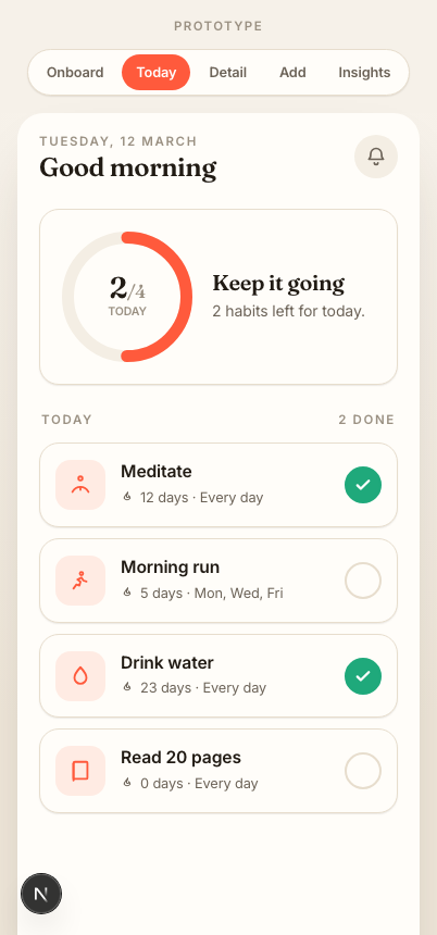
I started in low fidelity to settle structure before style. The first home screen tried to show every habit's full history at once and felt heavy, so I cut it back to today's list plus a single progress ring, and pushed history into the detail screen.
Today
Add habit
Detail
A small, warm system.
A single primary (ember), one success colour, and warm neutrals on a paper canvas. A serif display (Fraunces) gives it personality; Inter keeps the UI calm. Everything sits on a 4-point spacing scale with three radii, so new screens stay consistent by default.
From problem to solution.
A progress ring shows how many habits are done today. The number can dip but never shames; the copy stays encouraging.
The detail screen leads with the current streak, then a 17-week heat map so consistency is visible even after an off day.
Try the real thing.
The prototype is fully clickable: toggle habits, open a detail screen, create a new habit, and switch the accent live. Built in React so the design survives implementation, and resizes from phone to desktop.
Open live prototypeWhat I'd do next.
If I kept going, I'd user-test the streak language to confirm it actually lowers the cost of a missed day, and design an empty and first-week state for brand-new users who have no history yet. The biggest lesson was restraint: the home screen got better every time I removed something.